Data is a tool; how you use it, is the art
 Photo by RODNAE Productions on Pexels.com
Data visualization not only deals with expressing your data in visualized formats( infographics, images, clip arts, charts, etc.); it extends to ensuring that these formats aid consumers’ ability to easily internalize the identified patterns and insights in the data, and the stories or realities behind each pattern or insight. Simply put, data visualization holds the key to unraveling the truth embedded in the data through its relatable data stories.
Data Storytelling
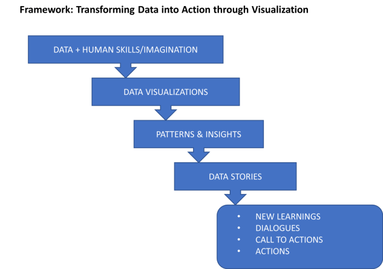
The concept of using stories to relay the realities embedded in your data is called data storytelling. This concept holds the assumption that your data must transform from mere data to visualization, which in turn must transform to patterns and insights, which must then transform to data stories, that will instigate actions, call to action, business decisions, dialogues, etc among data end-users and audience.
Data, Data Visualization, Data Storytelling, and Quality
The successful transformation of data to the end product of compelling data stories depends solely on the quality of data, then on the quality of data visualizations. This is analogous to the curious case of “garbage-in garbage-out (GIGO)”. This simply means, if the visualization makes sense, the data stories will too; if it does not, the data stories also suffer, simply put, the truth in your data will not be told.
The conceptual framework below shows the transformation of data to the eventual data use by the final audience.
Tips To Generating Compelling Data Visualization
So how do you generate compelling data visualizations that will pour out all the realities the data reflect through data stories? In this article, we will state 23 tips to ensuring that your data totally tell the stories embedded in it through the use of visualization.
23 Useful Tips To Creating Compelling Data Visualization
1. Know your audience, this is fundamental and core. Consumers determine the type of products producers make, not the other way. You must know who your audience are, what their goals are, what decisions they need to make, what their background is(educational status, experience, age, religion, level of liberality, etc.), what their nuances and norms are, etc.
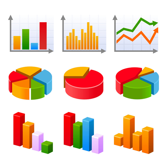
2. Decide on the appropriate chart to use, depending on your goal. If you want to show distributions, use — bar chart, histogram; for comparison, use — bar chart, line chart; for composition, use — pie chart, treemap, stacked bar chart; for relationship, use — scatterplot; for trends, use — line chart; for geospatial distribution, use — chloropleth chart; for an overview, use — table; for ranking, use — bar chart; for illustrations, use — clip arts, images; for cumulative distribution, use — water chart; for popular keyword or figure, use — tag cloud, bold capitalized and increased font size; for human-angle stories, use — photos, photo-series.
3. Use an opaque or not too bright image your audience can relate with it, as the background of your presentation, brief, etc (A transparency value ranging from 86% — 90%, will do). For example, If your data presentation is about adolescents; your presentation’s background can have an image relating to adolescents.

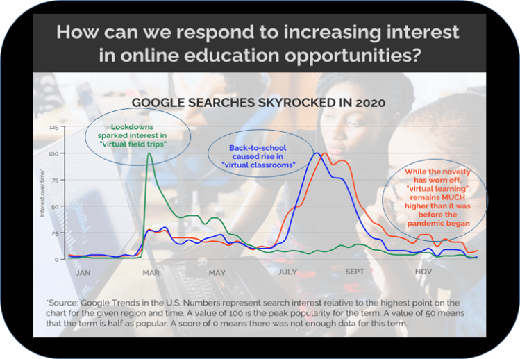
4. You can add small but visible annotations to your graph to tell stories of the changing patterns indicated by the graph. In the figure below, annotations are the circled text.
5. You can embed the key message of your slide just on the free space above your graph. In the figure below, the key message is — “ Google searches skyrocked in 2020”
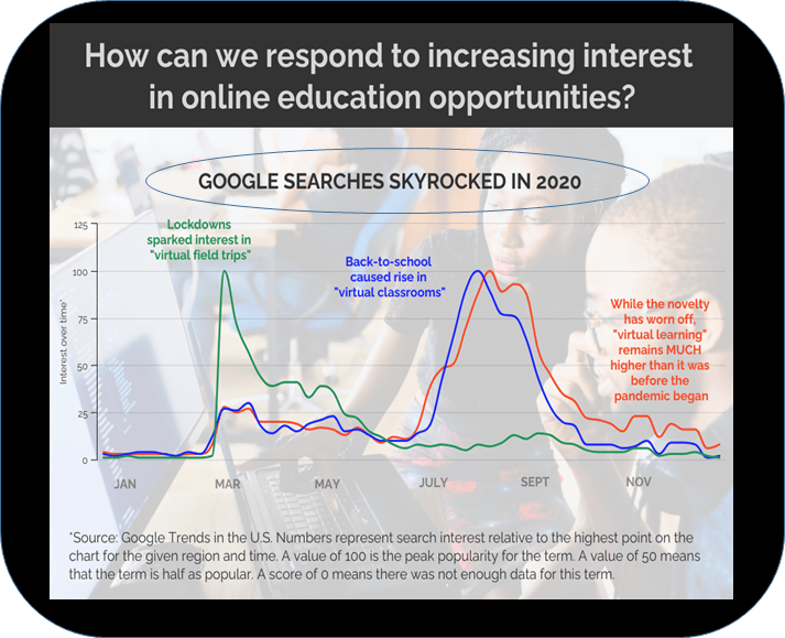
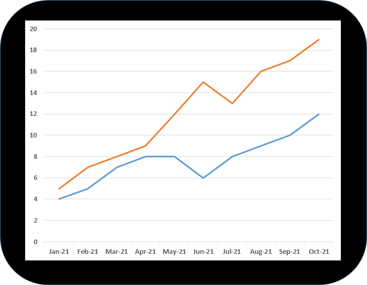
6. Contrast the color of the lines in a line graph. In the figure below, there are two trends line with contrasting colors of blue and orange.
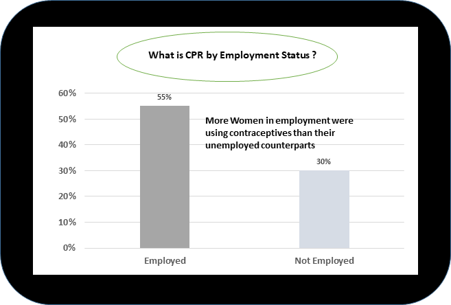
7. The heading/title of your slide can take a question form. You can then use your graph and annotation to answer the question. You can also make the title a call to action, a key message (Imagine the newspapers we read not having headlines)
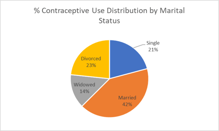
8. All labels/annotations should be with the part of the graph/chart they are meant to describe. If you can, avoid the use of legends. For E.g. Labels of a pie-chart should be in their appropriate sector, not by a legend.
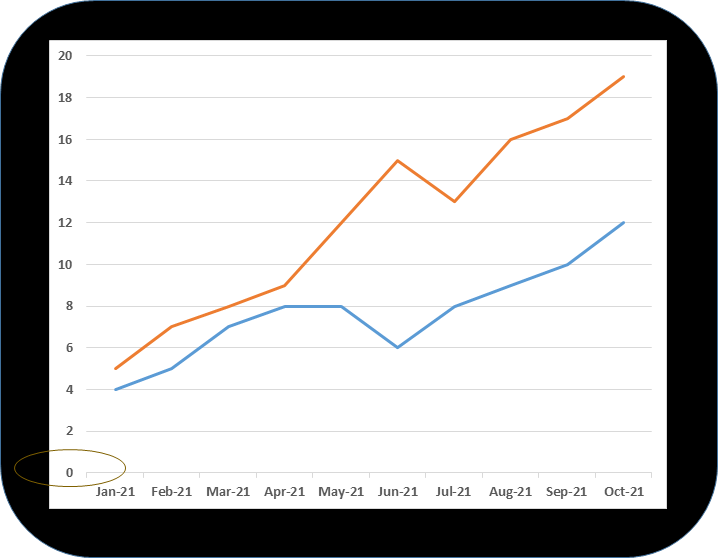
9. In a bar chart or any visualization chart that requires the use of an axis (X, Y-axis), avoid the distortion of the axis. All axis must start from zero.
10. Avoid the use of 3D graphs(three-dimensional charts); they are a huge distraction; use 2D, it is better.

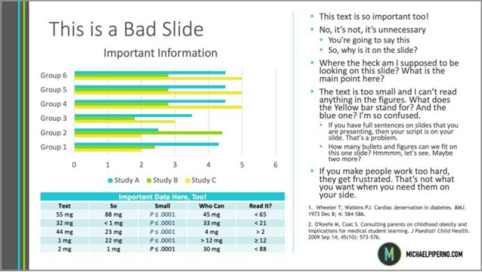
11. Avoid overloading your slide with a lot of information. If you have a lot of information, split it into mini-charts and use coloring, and shapes to emphasize each importance.
12. Conduct a data-ink to non-data-ink ratio analysis. The data-ink ratio should be high. Data-ink refers to the part of your slides that is imperative & indispensable to your message(label, graph). Make things simple and clear; not confusing, heavy, and complex. If a layman can understand your visualization, then the data-ink ratio must be high and appropriate. Non-data-inks from your slide may be legends, gridlines, 3D, axis lines, unimportant or unnecessary bars, colors, clip arts, or images.)
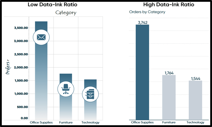 Source: Oreilly library
13. Outline your line of thought (maybe on a notepad) before commencing data visualization. It is imperative you do.
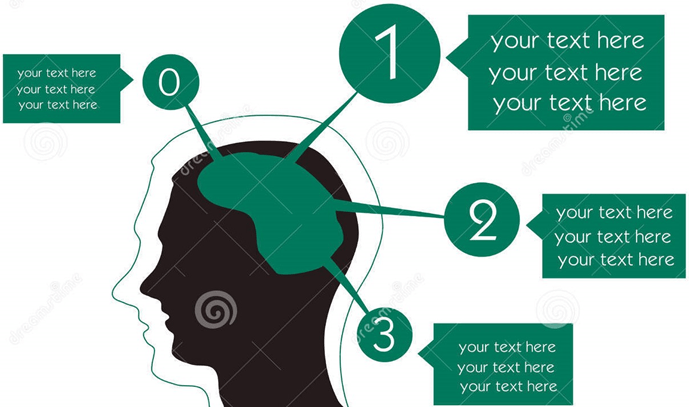
14. Identify data visualization templates that have themes that correspond to your message.

15. Relate your data with things your audience can relate with or are familiar with. Compare your concept, message with what they know. If your audience are community leaders, relate your data to what they are very familiar with within their community, if they are policymakers, relate it with relevant and popular policy within their community of practice.

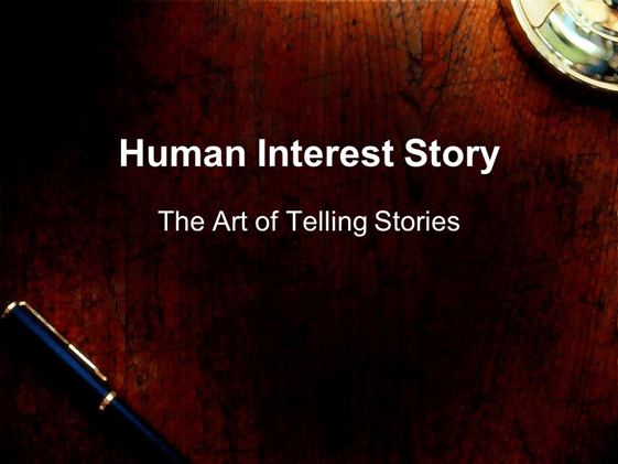
16. For deep emotional connection; you can deploy human-interest stories as the beginning part(story arc) of your presentation, before deploying your charts, and statistics. For example, if your data is on violence against girls seeking education in Pakistan, you can start by telling the compelling story of Malala Yousafzai, and there afterward share the insights and stories in your data. If your data is on the poor economic situation in Ogun State, Nigeria. You can start by telling a story of a struggling household before sharing the data insights or stories.
17. You should use arrows, spheres, circles, and other shapes to indicate and emphasize the most important part of your chart or presentation.

18. The fundamental to a compelling data story is truthfulness and honesty. Ultimately, data generation, processing, and analysis must be of optimum quality.
 Source: https://sites.google.com/site/happinessbusinessbb102/hom
19. If you are using PowerPoint to present your data, you can deploy PowerPoint animation when you need the contents of your slides to be ordered, and your thought process organized.
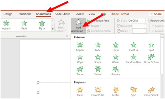
20. Consider your presentation slides as movie scenes that come one at a time to make the audience stay glued: Combine animation with numbering to ensure your audience follows you per time.
 Source: https://www.freeiconspng.com
21. Only use real-life images, pictures when referencing real-life situations or examples. Only use icons/clip arts etc when making statements of facts, or illustrations.

22. Colours can be an inhibitor or enabler of your insight, so must be used strategically. The less, the better. Change of colors should be done only on the part you want to emphasize. You can deploy shapes in this regard.
 Source: NA
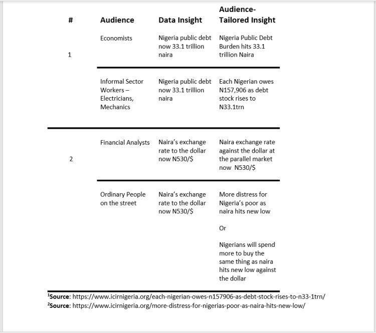
23. Relate the data’s patterns and insights, and stories with your audiences’ day-to-day language.
In Summary
Data visualization is imperative for making sense of data. It helps in delivering the data to the needing audience(decision-makers) in ways they can understand and need. They serve as intermediary that transforms mere data to patterns and insights, then to the realities in the data through data stories.
Data stories are basically contextualized insights and patterns. They say what the insights and patterns mean within the context of the subject matter. Simply put, they relay the reality implication of the insights and patterns in your data.
Originally published at https://researchdataguy.com.
23 practical and useful tips to creating compelling data visualization was originally published in DataDrivenInvestor on Medium, where people are continuing the conversation by highlighting and responding to this story.
